ShopDreamUp AI ArtDreamUp
Deviation Actions

Hello,  here. If you are interested in Prismacolor markers and their uses, then this might just be worth a read. I currently own a 144-piece set, and have run dry several smaller sets in the past year and a half. For this review, keep in mind that all colors that are capitalized (i.e. Violet or Yellowed Orange) are the actual color names of the markers used in the examples. All examples used are credited to the original artist (Mostly me) in the description as well as in the link.
PRICES: As with all Prismacolor products, the markers can be quite spendy. I have seen them anywhere from $1.50 to $6.00 per marker. From personal experience, I would not advise paying much more than $2.00 per marker, especially when buying in bulk. Individual markers are always more expensive, but anything over about $2.75 a piece is unreasonable. When on the trail of good deals, surfing the net and checking out art supply sites is always a good idea. My personal favorite is DickBlick.com, where individual Prisma markers are a mere $2.18.
SMELLINESS: Another heads-up for potential buyers: Prismacolor markers have quite a distinctive scent! The markers are solvent-based, not alchohol-based, but they still manage to produce a considerable smell. For anyone using them, I would suggest drawing outside, near an open window, or using a fan. I have become accustomed to the reek, but the fumes can't be healthy to breathe. After use, leave your drawing out overnight (Rather than closing it in your drawing book or something) so it will air out. No worries- This is usually all it takes to de-stink your artwork. My past Prismacolor marker works have no distinguishable scent at all!
No worries, though. Prismacolor markers are completely non-toxic and are safer than most professional products of this potency.
GENERAL MARKER INFO: For those who don't know, Prismacolor markers are rather fat, with four different tip widths. All four widths are on every marker; The three thickest are together on one end, and are used by turning the marker at different angles. Though it may sound strange, I have found this feature to be actually quite convenient. The fourth tip, a skinny tip similar to nearly any thin-tip marker, is found alone on the other end. It is particularly useful for coloring in tiny areas, or for writing, sketching, and detail work. Between the four tip widths, Prismacolor marker art can look like anything from paint to pastel to CRAYON. Here is a picture showing the markers, their stands, and the boxes they come in: image.misterart.com/grouppix/5…
For those accustomed to the pencils, know that the markers match perfectly with them! Each pencil has a marker equivalent, making it extremely easy to continue using your favorite color schemes. A color comparison can be seen here: www.deviantart.com/deviation/2…
STORAGE: Here is a good look at the "Studio Stacker" that is usually included in all but the six- and twelve-piece sets: www.jerrysartarama.com/images/… Though awkward and space consuming, the stackers are very useful for holding the markers and displaying all of the colors during a coloring session. The center bar of the stackers can be swiveled, offering a range of angles for your markers, as well as the choice of vertical or horizontal stacker orientation. I prefer to organize the markers spectrum-style with the thick end of the marker down, as the end in the air is never as juicy as the one facing downward. This way, the thick end is always full of pigment and ready for action. When planning to use the thin tip, turn the markers the other way around in preparation, particularly as they become dry with use. Don't let this mislead you, as the end pointing upward still functions and will not dry out.
Aside from the Studio Stackers, closeable carrying cases of various sizes are also available. They are excellent for the artist on the move, as the Stackers are difficult to assemble and come apart easily.
As for actually storing the markers, I would recommend a location out of direct sunlight and without extremes of temperature. I keep mine in my closet. Don't let your markers fry in the sun or in the extreme heat of, say, a car trunk, and also don't allow them to freeze. It will mess up the ink and perhaps cause leakage or even exploding. Another thing, don't shake them, as that will also mess up the ink by causing it to froth.
Long car rides, however, are safe. I have had my Prisma markers jiggling in a car for as long as twelve hours straight and they were fine. I have also taken them camping and other strange situations, and I can vouch for the toughness of these markers. Avoid being mean to them but know that they're somewhat hard to destroy. If they get dropped in the dirt, don't be afraid to wash them off since they are water-tight when the caps are on and the wrappers can withstand being wet without shriveling or coming off. I have even went so far as to scrub some of mine with soap and warm water after a messy incident and the wrappers look as good as new.
COLOR RANGE: As is true with every Prismacolor product, Prismacolor markers come in a dazzling range of colors. Even a set of 48 is equipped with all of the colors needed for nearly every genre of art, including darks, brights, pastel shades, and a skin tone or two for portraits and cartoons. Prismacolor marker sets of 6, 12, 24, and 48 do not contain grays or metallics, only colors. (People with older sets may think me wrong; Prismacolor recently changed so only the sets of 72 or more markers contain grays and metallics.)
As for the full range of 144 colors, all the better! Prismacolor markers offer over a dozen colors that could serve as skin tones, as well as a strong supply of darks, brights, pastels, and neutrals that will satisfy artists of all genres. Every color of the spectrum is well represented with at least a dozen shades, except for the purples. The purples are the only Prismacolor range that I am disappointed with, since it is limited and missing many important shades. Most of the purples are either blue-ish, pinkish, or grayish with no nice, bright purples anywhere to be seen. Any shade of purple can be mixed using blue, red, and pink markers, but actual purple markers are in short supply.
GRAYS: Prismacolor markers come with a total of 27 grays, which are highly useful for toning colors. There are nine each of Cool Gray, Warm Gray, and French Gray, from 10% value (lightest) to 90% value (darkest). It may sound like overkill but I have learned to depend on these grays and to use each value of each type of gray where I need it.
METALLICS: Prismacolor markers come with metallic Gold and Silver. Unlike the rest of the range, which come in double-ended markers, the metallics are available in a fine-point marker and a thick-point marker each. So, there are four metallic Prismacolor markers to be had: Fine-point Gold, thick-point Gold, fine-point Silver, and thick-point Silver. The metallic markers are of different thicknesses from the rest of the Prismacolor markers and come with adapters so they will fit in the Studio Stackers with the rest. They have an internal ball-bearing and require shaking to mix the ink. However, the Gold and Silver are highly potent, thick, and opaque, a vast different from the rest of the colors, which are transparent. The Gold and Silver work marvelously on black paper and will layer their thick, metallic color over anything. If not well-shaken, a goo will make the area around the metallic color look a bit strange but basically they function like nearly any metallic markers. Make sure to shake them well and be patient with them!
A warning: The metallics can be a bit stubborn and sometimes refuse to work at first. The fine-point metallics in particular are prone to drying out or clogging and may require manual repair. When mine wouldn't work, I removed the tip (It comes off with a firm tug) and pierced a hole for the metallic ink to go through to get to the tip of the marker. Be careful and use something tiny, like a needle, since the metallic ink can be spilled when the tip is removed and piercing a hole that is too large will result in uncontrollable ink flow. This procedure has been necessary only once per fine-point metallic marker for mine to start working and keep working.
USES: That said, I shall move on to how they PERFORM. Prismacolor markers can achieve various effects depending on the vitality of the marker and the paper type used. Juicy new markers have effects similar to paint, with wonderful bleeding, blending, puddling, and mixing properties. An example of my own work, made using many of the techniques covered in this review: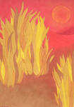 www.deviantart.com/deviation/1…;
Also worth mentioning here is the amazing ability of the markers to even themselves out into a smooth wall of color. By this I mean that when used on the right papers, Prismacolor marker pigment will lay down so evenly that it will appear that you have drawn on colored paper! This is visible in this drawing of mine: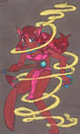 www.deviantart.com/deviation/1… For this piece, I applied French Gray 70% all around the character. Look closely- No blotches, no strokemarks. Solid color! The ink will bleed and even itself out.
PAPER SUGGESTIONS: I have found that they generally work their best on medium-weight, non-rough papers. For those not overly familiar with paper types and weights, normal computer paper is usually 25# (# meaning "pound") non-rough. Watercolor painting paper is 90# clear up to 500# textured. GET TO KNOW YOUR PAPER! Look at the labels and tags when buying, and try to avoid terms such as "rough" and "smooth". Rough paper (Which is different from textured) is generally of looser fiber composition. This causes a terrible amount of bleed and an over-accentuation of the paper fiber, as well as overly stark blending. Smooth paper is difficult for the markers to soak into, leading to non-permanency, little or no blending, and dulling of the colors. However, note that some paper labeled "smooth" is excellent for Prismacolor markers. Papers such as "smooth cardstock" and others are excellent because they have tight paper grain, which virtually eliminates bleeding. Basically, if it's shiny and non-porous, it will not absorb ink well.
Paper weight is usually not important. For instance, I experienced about a quarter-inch of bleed and terrible blending on 75# rough paper, while barely any bleeding and excellent blending occurred on 80# regular paper. Type, not weight, is key. Excessively absorbant papers, such as thick watercolor paper, are undesirable as they suck up massive amounts of ink and produce splotchy art.
RECOMMENDED PAPER: Smooth bristol! This stuff is the best paper for Prismacolor markers that I have ever found. It is extremely cheap and has many properties perfect for these markers. On smooth bristol, Prisma markers shine bright, blend amazingly, puddle cooperatively, and bleed not one hair! Smooth bristol will recieve dozens of layers of ink without the surface of the paper breaking down or losing responsiveness, and without the colors muddying together. This promotes mixing and blending. Despite this, smooth bristol does not suck up an excessive amount of ink like watercolor and other absorbent paper will, so you get the maximum amount of color with the minumum amount of ink. Everything about this paper matches perfectly with Prismacolor markers and I guarantee that the two will work in perfect harmony.
INK PROPERTIES: But exactly what is Prismacolor ink like? Prismacolor marker ink is unusual and has several strange properties. It is completely transparent, similar to watercolor paint. So, do not expect Prisma markers to show at all on darkly-colored paper. The ink is also similar to watercolor paint in consistency, being thin and watery, not the least bit thick. This means that the ink soaks into the paper and does not leave a "film" or any sort of texture difference from the original feel of the paper.
Prisma ink is completely waterproof, but highly invasive. That is, is disintegrates other media and will dissolve any non-waterproof media. Be careful when using Prismacolor markers to color in penned art because if the pen used was not waterproof, it will feather and smear. The pen must be waterproof in order to withstand Prismacolor ink. Do not confuse "waterproof" with "permanent"! Even permanent inks, such as Sharpie markers, are not waterproof and will be dissolved by Prismacolor ink. Ballpoint pens are the worst for use with these markers and will smear horribly at the slightest touch of the markers. Pens I have found with ink that can withstand Prismacolor markers include waterproof Uniball pens, Pitt Artists pens, and Sakura Pigma Microns.
Prismacolor ink will also dissolve medias such as paints and pencil lead. I have used them over Prismacolor pencils and the lead will smear, gunking up the markers' felt tip. The change of texture caused by using Prismacolor markers over Prismacolor pencils does have some uses (Such as re-toning saturated pencil work for extra layers of lead or helping to smear pencil colors) but mostly just destroys the marker tips.
COLORING TECHNIQUES [wet marker]: Prismacolor markers, in a way, are like "magic markers". That is, if you put a lighter color over a darker one, it will lighten. Even black can be lightened to a certain extent. I have lightened Black with Canary Yellow, and from personal experience I can say that this is safe to do, as the darker color does not soak into the tip of the lighter one and ruin its color value (As is common with cheaper markers). This ability of the markers can be used to create interesting lighting effects or improve blending. An example of my own work: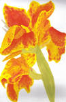 www.deviantart.com/deviation/2… Hopefully, the scan will show the altered color values around the edges of the dark parts, where I layered the lighter colors over the darker ones they came in contact with. I worked from dark to light, using this "magic marker" effect to lessen the contrast of the spots, making the mottling look more natural.
This effect is excellent for blending colors, as it smooths gradations and helps give a colored item a look of "one-ness". In this drawing (Another one of mine, using most of the same colors as the last one):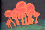 www.deviantart.com/deviation/9… I worked from dark to light, layering the lights over the darks to make the mushrooms look whole, individual, and to make them stand out from the black.
A tip for making a lightly-colored subject stand out from a darkly covered backdrop when using Prismacolor markers: Work from the back to the front, letting each layer bleed a bit and slightly overlap the part behind it. This adds depth, and prevents the artist from having to worry over the bleed. It helps to prevent the subject from looking like it is indented into instead of IN FRONT OF the dark background. This works well for all parts of a given marker picture. Use the "back to front" technique any time depth is necessary, such as in drawings without outlines.
Another property of color layering is the ability to use Prismacolor markers to create NEW colors. That's right, completely new colors! I did this often when I only had a 48-piece set. I warn anyone planning to buy the 48-piecer: It contains only TWO purples, Violet and Lilac. (Otherwise, it's very well stocked). It was because of this purple dilemma that I discovered the ability to blend new colors. I needed a bright, orchid purple, and couldn't settle for anything else. To achieve it, I colored the subject first with Slate Blue, and then put Rhodamine (A neon pink) on top. Look closely at the main fur color on this drawing of mine: www.deviantart.com/deviation/1… That bright purple is made up of blue and pink, with Violet around the very edges. Using this technique, my good friend CrazySkye has overcome her limited palette (Just twenty-four markers, I do believe). Here is one of her drawings:
 www.deviantart.com/deviation/1… Read her description for more details on how she created so many different colors!
Not only will this technique get you the color you want; It will also make the color more two-toned and variegated as opposed to perfectly solid. Play around with the saturation of the darker undercolor in order to purposely create areas of different hues. You can also see what happens when a third color is added! Experiment and see what colors you can create!
Similar to blending new colors, this technique doubles to change the values of colors. Like paints, when you mix in white or black to lighten or darken a pigment, Prismacolors can also be manipulated using neutrals. Take this drawing, another one of mine, for example: www.deviantart.com/deviation/1… (Forgive me, for I knew nothing of shading and contrast then!) Every item but the moon has been dulled with grays in order to give it a moldy, rotten look. This is done by putting one color on top of the other, with the darker one layed down first. For her orange-ish fur, I put down Cool Gray 30% in an uneven manner and then layered Yellowed Orange over it. This gave a moldy, variegated look. To see the effect of the gray, look at the link again and realize that the orange of the moon and the orange of the fur are the same! To make the darker area shadowing her eyes, I put another layer of gray over the orange. The ribbons (Which I wish I had made darker) are made with Cool Gray 10% and some sort of peach-ish pigment, I don't recall.
Take into account that certain combinations when layering will not have noticeable effects. Look, once again, at this drawing (I shall re-link for courtesy! www.deviantart.com/deviation/1… ) and concentrate on the tree branches. Because I used a gray and a brown that were too similar, there was almost no effect. And as for layering wildly different colors, beware of creating ugly tones! For safety, experiment first before trying it on your masterpiece-in-progress.
Just a note: When using the layering technique for new/altered colors, keep in mind that the product is affected by whether or not the underlayer is wet when the new color is applied. If the bottom layer is wet, it will cause additional bleeding. Look closely at that same picture; The bleeding is very visible around her hair because I applied the Crimson Red while the underlying Cool Gray 50% was still wet. This is always true with Prismacolor marker art; Use it to your advantage! If you want fuzziness, proceed while the ink is wet. If you want sharper, cleaner lines, wait until the ink dries. (Which, by the way, usually doesn't take long.) For both in one example, look at another one of my pieces: www.deviantart.com/view/104161… (I have linked to the full view because the detail simply cannot be seen in the preview.) Take a careful look at her fur. I put down gray first, then blotches of browns, and then added details with the thin end of a black marker. If you look very closely, you will see that the brown blotches are fuzzy, while the black markings are sharp. This is because I applied the browns while the gray was wet, and added the black after it had dried. Simple, yet effective!
Most of the techniques above involve using only the thick end of the marker. CrazySkye graciously agreed to let me use more of her work in my review, as she does wondrous things with the thin tip. Take a good look at this drawing of hers: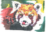 www.deviantart.com/deviation/1… This is an excellent example of how to blend new colors with the thin tip while adding lots of texture and detail, a thing my own marker art rather lacks. By using the thin tip, you can produce styles such as impressionism and pointilism.
In this drawing, also by CrazySkye, you can see more of the thin tip at work: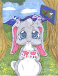 www.deviantart.com/deviation/1… Note how she uses the thin tip to place darker colors over lighter ones for texture effects.
I apologize for the lack of descriptive depth concerning my friend's work. Because I did not make those pictures myself, there is only so much I can say about them. If you have any questions for CrazySkye, send her a note!
COLORING TECHNIQUES [dry marker]: Of course, all of the layering, altering, bleeding, etc. techniques only work with JUICY markers. This means that the effects won't occur once the markers are on their last legs. But, I reiterate, don't throw away dying markers! They have their purposes, too! If you aren't into the "wet marker" effects, dry markers can be used to mimic crayon or pastel. I have only limited experience with "dry marker" techniques, but what I've tried has proven to be very useful.
For color blending, there is a "dry marker" alternative to the layering techniques described earlier. Here is my best example: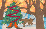 www.deviantart.com/deviation/1… All of this was done in juicy markers EXCEPT for the sky. Though marker strokes are still visible, note that the Deco Pink, Blush Pink, Deco Yellow, and Yellowed Orange of the sky have blended fairly harmoniously. The key to dry marker blending is to overlap the colors a lot, using the faintness and lack of saturation to your advantage. Use them similarly to pencils when doing this, making gradations by pressing very hard and working lighter and lighter, then overlapping and blending in more colors. This is more time-consuming than wet marker blending, but it requires less ink, obviously.
If the colors don't seem to be cooperating, you can go over them with a juicy marker of a very light color in order to induce blending. In this drawing of mine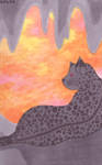 www.deviantart.com/deviation/1… , I used the same colors for the background, only I went over it witha juicy Deco Yellow to smooth things out. Not perfect, of course, but better than it was. Also in this picture, you can see the "back to front" depth technique at work, as certain items appear to be in front of/behind other items in the picture despite the lack of outlines. Remember, this technique works by letting each layer bleed slightly over the layer behind it, so that appears to be on top/in front of it. It worked particularly well with the eye. The "magic marker" effect can be seen in the pinkish blotches behind the black spot markings (Look carefully!), because they lightened the gray. Never be afraid to put a light color on a darker one when using Prismacolor markers!
Dry markers can also be used for a sketchy, crayon-like effect. Here is my example: www.deviantart.com/deviation/2… (Full view for a better look at the texture!) As you can see, the texture shown here is nothing like the previous examples. Even dying markers still have something to offer!
COLORLESS BLENDER MARKER: I admit that I haven't used my coveted Colorless Blender marker much at all. I have found that a Colorless Blender marker can be sacrificed and used to smear or tone art done with Prismacolor pencils without affecting the color. It is more useful, however, to be used with its fellow markers to achieve bright whites and reclaim highlights and sparkles. The Colorless Blender is a dazzling white and when used over other markers will bleach out the color. Not effective for huge areas, but good for little sparkles, shines, and highlights like I said.
ADDITIONAL COMMENTS: In conclusion, I would like to say that Prismacolor markers are one of the most useful, forgiving, multi-purpose, and moreover, FUN art supplies I have ever used. There is no wrong way to use a Prisma marker! If you have a question or a suggestion, feel free to note me, Peachfuzz, or post your comments here on this journal. For other Prismacolorists members, mark your tips with your username and feel free to place your additions in the comments of this journal! This is a club meant for sharing not only art, but thoughts and techniques as well.
here. If you are interested in Prismacolor markers and their uses, then this might just be worth a read. I currently own a 144-piece set, and have run dry several smaller sets in the past year and a half. For this review, keep in mind that all colors that are capitalized (i.e. Violet or Yellowed Orange) are the actual color names of the markers used in the examples. All examples used are credited to the original artist (Mostly me) in the description as well as in the link. PRICES: As with all Prismacolor products, the markers can be quite spendy. I have seen them anywhere from $1.50 to $6.00 per marker. From personal experience, I would not advise paying much more than $2.00 per marker, especially when buying in bulk. Individual markers are always more expensive, but anything over about $2.75 a piece is unreasonable. When on the trail of good deals, surfing the net and checking out art supply sites is always a good idea. My personal favorite is DickBlick.com, where individual Prisma markers are a mere $2.18.
SMELLINESS: Another heads-up for potential buyers: Prismacolor markers have quite a distinctive scent! The markers are solvent-based, not alchohol-based, but they still manage to produce a considerable smell. For anyone using them, I would suggest drawing outside, near an open window, or using a fan. I have become accustomed to the reek, but the fumes can't be healthy to breathe. After use, leave your drawing out overnight (Rather than closing it in your drawing book or something) so it will air out. No worries- This is usually all it takes to de-stink your artwork. My past Prismacolor marker works have no distinguishable scent at all!
No worries, though. Prismacolor markers are completely non-toxic and are safer than most professional products of this potency.
GENERAL MARKER INFO: For those who don't know, Prismacolor markers are rather fat, with four different tip widths. All four widths are on every marker; The three thickest are together on one end, and are used by turning the marker at different angles. Though it may sound strange, I have found this feature to be actually quite convenient. The fourth tip, a skinny tip similar to nearly any thin-tip marker, is found alone on the other end. It is particularly useful for coloring in tiny areas, or for writing, sketching, and detail work. Between the four tip widths, Prismacolor marker art can look like anything from paint to pastel to CRAYON. Here is a picture showing the markers, their stands, and the boxes they come in: image.misterart.com/grouppix/5…
For those accustomed to the pencils, know that the markers match perfectly with them! Each pencil has a marker equivalent, making it extremely easy to continue using your favorite color schemes. A color comparison can be seen here: www.deviantart.com/deviation/2…
STORAGE: Here is a good look at the "Studio Stacker" that is usually included in all but the six- and twelve-piece sets: www.jerrysartarama.com/images/… Though awkward and space consuming, the stackers are very useful for holding the markers and displaying all of the colors during a coloring session. The center bar of the stackers can be swiveled, offering a range of angles for your markers, as well as the choice of vertical or horizontal stacker orientation. I prefer to organize the markers spectrum-style with the thick end of the marker down, as the end in the air is never as juicy as the one facing downward. This way, the thick end is always full of pigment and ready for action. When planning to use the thin tip, turn the markers the other way around in preparation, particularly as they become dry with use. Don't let this mislead you, as the end pointing upward still functions and will not dry out.
Aside from the Studio Stackers, closeable carrying cases of various sizes are also available. They are excellent for the artist on the move, as the Stackers are difficult to assemble and come apart easily.
As for actually storing the markers, I would recommend a location out of direct sunlight and without extremes of temperature. I keep mine in my closet. Don't let your markers fry in the sun or in the extreme heat of, say, a car trunk, and also don't allow them to freeze. It will mess up the ink and perhaps cause leakage or even exploding. Another thing, don't shake them, as that will also mess up the ink by causing it to froth.
Long car rides, however, are safe. I have had my Prisma markers jiggling in a car for as long as twelve hours straight and they were fine. I have also taken them camping and other strange situations, and I can vouch for the toughness of these markers. Avoid being mean to them but know that they're somewhat hard to destroy. If they get dropped in the dirt, don't be afraid to wash them off since they are water-tight when the caps are on and the wrappers can withstand being wet without shriveling or coming off. I have even went so far as to scrub some of mine with soap and warm water after a messy incident and the wrappers look as good as new.
COLOR RANGE: As is true with every Prismacolor product, Prismacolor markers come in a dazzling range of colors. Even a set of 48 is equipped with all of the colors needed for nearly every genre of art, including darks, brights, pastel shades, and a skin tone or two for portraits and cartoons. Prismacolor marker sets of 6, 12, 24, and 48 do not contain grays or metallics, only colors. (People with older sets may think me wrong; Prismacolor recently changed so only the sets of 72 or more markers contain grays and metallics.)
As for the full range of 144 colors, all the better! Prismacolor markers offer over a dozen colors that could serve as skin tones, as well as a strong supply of darks, brights, pastels, and neutrals that will satisfy artists of all genres. Every color of the spectrum is well represented with at least a dozen shades, except for the purples. The purples are the only Prismacolor range that I am disappointed with, since it is limited and missing many important shades. Most of the purples are either blue-ish, pinkish, or grayish with no nice, bright purples anywhere to be seen. Any shade of purple can be mixed using blue, red, and pink markers, but actual purple markers are in short supply.
GRAYS: Prismacolor markers come with a total of 27 grays, which are highly useful for toning colors. There are nine each of Cool Gray, Warm Gray, and French Gray, from 10% value (lightest) to 90% value (darkest). It may sound like overkill but I have learned to depend on these grays and to use each value of each type of gray where I need it.
METALLICS: Prismacolor markers come with metallic Gold and Silver. Unlike the rest of the range, which come in double-ended markers, the metallics are available in a fine-point marker and a thick-point marker each. So, there are four metallic Prismacolor markers to be had: Fine-point Gold, thick-point Gold, fine-point Silver, and thick-point Silver. The metallic markers are of different thicknesses from the rest of the Prismacolor markers and come with adapters so they will fit in the Studio Stackers with the rest. They have an internal ball-bearing and require shaking to mix the ink. However, the Gold and Silver are highly potent, thick, and opaque, a vast different from the rest of the colors, which are transparent. The Gold and Silver work marvelously on black paper and will layer their thick, metallic color over anything. If not well-shaken, a goo will make the area around the metallic color look a bit strange but basically they function like nearly any metallic markers. Make sure to shake them well and be patient with them!
A warning: The metallics can be a bit stubborn and sometimes refuse to work at first. The fine-point metallics in particular are prone to drying out or clogging and may require manual repair. When mine wouldn't work, I removed the tip (It comes off with a firm tug) and pierced a hole for the metallic ink to go through to get to the tip of the marker. Be careful and use something tiny, like a needle, since the metallic ink can be spilled when the tip is removed and piercing a hole that is too large will result in uncontrollable ink flow. This procedure has been necessary only once per fine-point metallic marker for mine to start working and keep working.
USES: That said, I shall move on to how they PERFORM. Prismacolor markers can achieve various effects depending on the vitality of the marker and the paper type used. Juicy new markers have effects similar to paint, with wonderful bleeding, blending, puddling, and mixing properties. An example of my own work, made using many of the techniques covered in this review:
www.deviantart.com/deviation/1…;Also worth mentioning here is the amazing ability of the markers to even themselves out into a smooth wall of color. By this I mean that when used on the right papers, Prismacolor marker pigment will lay down so evenly that it will appear that you have drawn on colored paper! This is visible in this drawing of mine:
www.deviantart.com/deviation/1… For this piece, I applied French Gray 70% all around the character. Look closely- No blotches, no strokemarks. Solid color! The ink will bleed and even itself out.PAPER SUGGESTIONS: I have found that they generally work their best on medium-weight, non-rough papers. For those not overly familiar with paper types and weights, normal computer paper is usually 25# (# meaning "pound") non-rough. Watercolor painting paper is 90# clear up to 500# textured. GET TO KNOW YOUR PAPER! Look at the labels and tags when buying, and try to avoid terms such as "rough" and "smooth". Rough paper (Which is different from textured) is generally of looser fiber composition. This causes a terrible amount of bleed and an over-accentuation of the paper fiber, as well as overly stark blending. Smooth paper is difficult for the markers to soak into, leading to non-permanency, little or no blending, and dulling of the colors. However, note that some paper labeled "smooth" is excellent for Prismacolor markers. Papers such as "smooth cardstock" and others are excellent because they have tight paper grain, which virtually eliminates bleeding. Basically, if it's shiny and non-porous, it will not absorb ink well.
Paper weight is usually not important. For instance, I experienced about a quarter-inch of bleed and terrible blending on 75# rough paper, while barely any bleeding and excellent blending occurred on 80# regular paper. Type, not weight, is key. Excessively absorbant papers, such as thick watercolor paper, are undesirable as they suck up massive amounts of ink and produce splotchy art.
RECOMMENDED PAPER:
INK PROPERTIES: But exactly what is Prismacolor ink like? Prismacolor marker ink is unusual and has several strange properties. It is completely transparent, similar to watercolor paint. So, do not expect Prisma markers to show at all on darkly-colored paper. The ink is also similar to watercolor paint in consistency, being thin and watery, not the least bit thick. This means that the ink soaks into the paper and does not leave a "film" or any sort of texture difference from the original feel of the paper.
Prisma ink is completely waterproof, but highly invasive. That is, is disintegrates other media and will dissolve any non-waterproof media. Be careful when using Prismacolor markers to color in penned art because if the pen used was not waterproof, it will feather and smear. The pen must be waterproof in order to withstand Prismacolor ink. Do not confuse "waterproof" with "permanent"! Even permanent inks, such as Sharpie markers, are not waterproof and will be dissolved by Prismacolor ink. Ballpoint pens are the worst for use with these markers and will smear horribly at the slightest touch of the markers. Pens I have found with ink that can withstand Prismacolor markers include waterproof Uniball pens, Pitt Artists pens, and Sakura Pigma Microns.
Prismacolor ink will also dissolve medias such as paints and pencil lead. I have used them over Prismacolor pencils and the lead will smear, gunking up the markers' felt tip. The change of texture caused by using Prismacolor markers over Prismacolor pencils does have some uses (Such as re-toning saturated pencil work for extra layers of lead or helping to smear pencil colors) but mostly just destroys the marker tips.
COLORING TECHNIQUES [wet marker]: Prismacolor markers, in a way, are like "magic markers". That is, if you put a lighter color over a darker one, it will lighten. Even black can be lightened to a certain extent. I have lightened Black with Canary Yellow, and from personal experience I can say that this is safe to do, as the darker color does not soak into the tip of the lighter one and ruin its color value (As is common with cheaper markers). This ability of the markers can be used to create interesting lighting effects or improve blending. An example of my own work:
www.deviantart.com/deviation/2… Hopefully, the scan will show the altered color values around the edges of the dark parts, where I layered the lighter colors over the darker ones they came in contact with. I worked from dark to light, using this "magic marker" effect to lessen the contrast of the spots, making the mottling look more natural.This effect is excellent for blending colors, as it smooths gradations and helps give a colored item a look of "one-ness". In this drawing (Another one of mine, using most of the same colors as the last one):
www.deviantart.com/deviation/9… I worked from dark to light, layering the lights over the darks to make the mushrooms look whole, individual, and to make them stand out from the black. A tip for making a lightly-colored subject stand out from a darkly covered backdrop when using Prismacolor markers: Work from the back to the front, letting each layer bleed a bit and slightly overlap the part behind it. This adds depth, and prevents the artist from having to worry over the bleed. It helps to prevent the subject from looking like it is indented into instead of IN FRONT OF the dark background. This works well for all parts of a given marker picture. Use the "back to front" technique any time depth is necessary, such as in drawings without outlines.
Another property of color layering is the ability to use Prismacolor markers to create NEW colors. That's right, completely new colors! I did this often when I only had a 48-piece set. I warn anyone planning to buy the 48-piecer: It contains only TWO purples, Violet and Lilac. (Otherwise, it's very well stocked). It was because of this purple dilemma that I discovered the ability to blend new colors. I needed a bright, orchid purple, and couldn't settle for anything else. To achieve it, I colored the subject first with Slate Blue, and then put Rhodamine (A neon pink) on top. Look closely at the main fur color on this drawing of mine:
www.deviantart.com/deviation/1… That bright purple is made up of blue and pink, with Violet around the very edges. Using this technique, my good friend CrazySkye has overcome her limited palette (Just twenty-four markers, I do believe). Here is one of her drawings:
www.deviantart.com/deviation/1… Read her description for more details on how she created so many different colors!Not only will this technique get you the color you want; It will also make the color more two-toned and variegated as opposed to perfectly solid. Play around with the saturation of the darker undercolor in order to purposely create areas of different hues. You can also see what happens when a third color is added! Experiment and see what colors you can create!
Similar to blending new colors, this technique doubles to change the values of colors. Like paints, when you mix in white or black to lighten or darken a pigment, Prismacolors can also be manipulated using neutrals. Take this drawing, another one of mine, for example:
www.deviantart.com/deviation/1… (Forgive me, for I knew nothing of shading and contrast then!) Every item but the moon has been dulled with grays in order to give it a moldy, rotten look. This is done by putting one color on top of the other, with the darker one layed down first. For her orange-ish fur, I put down Cool Gray 30% in an uneven manner and then layered Yellowed Orange over it. This gave a moldy, variegated look. To see the effect of the gray, look at the link again and realize that the orange of the moon and the orange of the fur are the same! To make the darker area shadowing her eyes, I put another layer of gray over the orange. The ribbons (Which I wish I had made darker) are made with Cool Gray 10% and some sort of peach-ish pigment, I don't recall.Take into account that certain combinations when layering will not have noticeable effects. Look, once again, at this drawing (I shall re-link for courtesy! www.deviantart.com/deviation/1… ) and concentrate on the tree branches. Because I used a gray and a brown that were too similar, there was almost no effect. And as for layering wildly different colors, beware of creating ugly tones! For safety, experiment first before trying it on your masterpiece-in-progress.
Just a note: When using the layering technique for new/altered colors, keep in mind that the product is affected by whether or not the underlayer is wet when the new color is applied. If the bottom layer is wet, it will cause additional bleeding. Look closely at that same picture; The bleeding is very visible around her hair because I applied the Crimson Red while the underlying Cool Gray 50% was still wet. This is always true with Prismacolor marker art; Use it to your advantage! If you want fuzziness, proceed while the ink is wet. If you want sharper, cleaner lines, wait until the ink dries. (Which, by the way, usually doesn't take long.) For both in one example, look at another one of my pieces:
www.deviantart.com/view/104161… (I have linked to the full view because the detail simply cannot be seen in the preview.) Take a careful look at her fur. I put down gray first, then blotches of browns, and then added details with the thin end of a black marker. If you look very closely, you will see that the brown blotches are fuzzy, while the black markings are sharp. This is because I applied the browns while the gray was wet, and added the black after it had dried. Simple, yet effective!Most of the techniques above involve using only the thick end of the marker. CrazySkye graciously agreed to let me use more of her work in my review, as she does wondrous things with the thin tip. Take a good look at this drawing of hers:
www.deviantart.com/deviation/1… This is an excellent example of how to blend new colors with the thin tip while adding lots of texture and detail, a thing my own marker art rather lacks. By using the thin tip, you can produce styles such as impressionism and pointilism.In this drawing, also by CrazySkye, you can see more of the thin tip at work:
www.deviantart.com/deviation/1… Note how she uses the thin tip to place darker colors over lighter ones for texture effects.I apologize for the lack of descriptive depth concerning my friend's work. Because I did not make those pictures myself, there is only so much I can say about them. If you have any questions for CrazySkye, send her a note!
COLORING TECHNIQUES [dry marker]: Of course, all of the layering, altering, bleeding, etc. techniques only work with JUICY markers. This means that the effects won't occur once the markers are on their last legs. But, I reiterate, don't throw away dying markers! They have their purposes, too! If you aren't into the "wet marker" effects, dry markers can be used to mimic crayon or pastel. I have only limited experience with "dry marker" techniques, but what I've tried has proven to be very useful.
For color blending, there is a "dry marker" alternative to the layering techniques described earlier. Here is my best example:
www.deviantart.com/deviation/1… All of this was done in juicy markers EXCEPT for the sky. Though marker strokes are still visible, note that the Deco Pink, Blush Pink, Deco Yellow, and Yellowed Orange of the sky have blended fairly harmoniously. The key to dry marker blending is to overlap the colors a lot, using the faintness and lack of saturation to your advantage. Use them similarly to pencils when doing this, making gradations by pressing very hard and working lighter and lighter, then overlapping and blending in more colors. This is more time-consuming than wet marker blending, but it requires less ink, obviously.If the colors don't seem to be cooperating, you can go over them with a juicy marker of a very light color in order to induce blending. In this drawing of mine
www.deviantart.com/deviation/1… , I used the same colors for the background, only I went over it witha juicy Deco Yellow to smooth things out. Not perfect, of course, but better than it was. Also in this picture, you can see the "back to front" depth technique at work, as certain items appear to be in front of/behind other items in the picture despite the lack of outlines. Remember, this technique works by letting each layer bleed slightly over the layer behind it, so that appears to be on top/in front of it. It worked particularly well with the eye. The "magic marker" effect can be seen in the pinkish blotches behind the black spot markings (Look carefully!), because they lightened the gray. Never be afraid to put a light color on a darker one when using Prismacolor markers!Dry markers can also be used for a sketchy, crayon-like effect. Here is my example:
www.deviantart.com/deviation/2… (Full view for a better look at the texture!) As you can see, the texture shown here is nothing like the previous examples. Even dying markers still have something to offer! COLORLESS BLENDER MARKER: I admit that I haven't used my coveted Colorless Blender marker much at all. I have found that a Colorless Blender marker can be sacrificed and used to smear or tone art done with Prismacolor pencils without affecting the color. It is more useful, however, to be used with its fellow markers to achieve bright whites and reclaim highlights and sparkles. The Colorless Blender is a dazzling white and when used over other markers will bleach out the color. Not effective for huge areas, but good for little sparkles, shines, and highlights like I said.
ADDITIONAL COMMENTS: In conclusion, I would like to say that Prismacolor markers are one of the most useful, forgiving, multi-purpose, and moreover, FUN art supplies I have ever used. There is no wrong way to use a Prisma marker! If you have a question or a suggestion, feel free to note me, Peachfuzz, or post your comments here on this journal. For other Prismacolorists members, mark your tips with your username and feel free to place your additions in the comments of this journal! This is a club meant for sharing not only art, but thoughts and techniques as well.
Crisis over!
At least, over but for the mopping up. I still need to orient all the members to the new password, so please contact me at robertsloan2 (https://www.deviantart.com/robertsloan2) with a private message to get it and continue to be able to upload your own art.
The person who did it apologized to me in a private message and feels bad about it. I'm not revealing the username because it really was a misunderstanding. The club runs the way it always did. I just need to get the new password out to everyone as fast as possible so we can go back to normal.
At least now I know what happened! It's a huge relief to me. The honor system works -- every one of the members understood it and t
No Coup Today
Prismacolorists (https://www.deviantart.com/prismacolorists) is not an inactive account. It's also not going to become a Group. I founded it as a club, a particular type of club that I would have a lot less trouble running than admins of other clubs. We have hundreds of members all on an honor system that hasn't failed yet, the only glitch in the system is that sometimes I'm out of touch for a while and I need to pass on new members.
You can join just for messaging me. That remains true.
Since its founding, every member of Prismacolorists (https://www.deviantart.com/prismacolorists) became his or her own admin, posting your art and following the rules because -- we all liked it that way! You didn't have to wait for an
2009 Prismacolorists Contest Winners!
If you've been to http://www.prismacolor.com and signed up for mailings, you've also gotten the email with the 2009 Prismacolor National Contest winners. They are, as always, some great beauties!
One of them is from DeviantART:
http://avogel57.deviantart.com/art/After-Action-110094808 by Avogel57 (https://www.deviantart.com/avogel57) is the Grand Prize winner, in Graphite/Charcoal. Best of show. This incredible realist drawing by a veteran has a great story behind it, go to his Deviation to read more about what inspired the art. He worked from his own photos and sketches.
:thumb110094808: is the thumbnail. Full view on it for some incredible details.
Remember, if you use
New colored pencils book rocks!
Alyona Nickelsen, owner and author of http://www.BrushAndPencil.com and teacher of some incredible online classes in colored pencil realism, has just published The Colored Pencil Painting Bible, a big fat satisfying volume that covers numerous techniques.
Alyona's techniques are interesting. They vary quite a lot, she roughens paper, uses Odorless Mineral Spirits and solvents, uses sgraffito and lifting to lighten areas and covers every tool it's possible to use with colored pencils painting.
Her chapters dealing with composition, design, drawing and using Photoshop to alter your photo references and test colors are fantastic. Her prose sty
© 2005 - 2024 Prismacolorists
Comments135
Join the community to add your comment. Already a deviant? Log In
how lightfast are the results? I mean, I've heard some markers fade after a while